Creative Home Entrance Ideas: Practical Tips to Elevate Your Entryway
The entry to your home is more than a door; it is a sequence of sensory cues that influence mood, safety, and perceived value. Thoughtful design can make small spaces feel generous, quiet corners feel lively, and daily routines feel smoother. Whether you have a compact apartment threshold or a deep porch, the right mix of color, lighting, materials, and organization can turn arrivals and departures into moments you actually look forward to.
Outline
– Section 1: The arrival sequence—psychology, flow, and safety principles that guide welcoming entries.
– Section 2: Doors, colors, and materials—how to choose finishes, hardware, and details that endure.
– Section 3: Lighting and wayfinding—layering light, readable addresses, and low‑glare navigation.
– Section 4: Landscaping and thresholds—paths, plants, drainage, and weather protection for comfort.
– Section 5: Storage and seasonal personality—benches, hooks, and styling that evolves through the year.
The Arrival Sequence: Psychology, Flow, and Safety
A memorable entrance works like a short story with a clear beginning, middle, and end. Urban designers call this the “arrival sequence,” and you can apply it at home by crafting a gentle progression: the approach (street or corridor), the threshold (door area), and the first step inside. Each stage should reduce uncertainty, remove friction, and add a small moment of delight. That might be a change in texture underfoot, a framed view toward greenery, or the satisfying click of a solid latch.
Start with flow. Comfortable residential walkways are typically 42–48 inches wide so two people can pass, though 36 inches can work for tighter spaces. Keep the route visually clear: continuous edges, subtle contrasts in paving, and consistent lighting help visitors intuit where to go. A straight path reads formal; a slight curve introduces anticipation. Where space allows, a small “pause zone” near the door—think a wider landing or a planter bay—gives guests a place to adjust bags or find keys without feeling rushed.
Safety underpins ease. Well‑placed lighting, a level surface, and grippy textures minimize slips, especially in rain or snow. If steps are unavoidable, uniform risers and solid handholds matter more than decorative flourishes. For step‑free entries, aim for gentle slopes (around 1:20 for walkways) and flush transitions at the threshold. Sightlines also matter: avoid tall, dense plantings right beside the latch side of the door, and trim corners so you can see who is approaching without surprise.
Visual psychology plays a role. Humans tend to scan for contrast and edges; using a distinct yet harmonious door color or mat texture creates a confident focal point. Studies on curb appeal have linked tidy, well‑lit entries with higher perceived value, sometimes in the single‑digit percentage range—small design choices can compound into meaningful impressions. To guide choices, ask yourself: What do I want someone to notice first, and how quickly can they understand where to go and how to enter?
Door, Color, and Material Palette: A Durable Statement
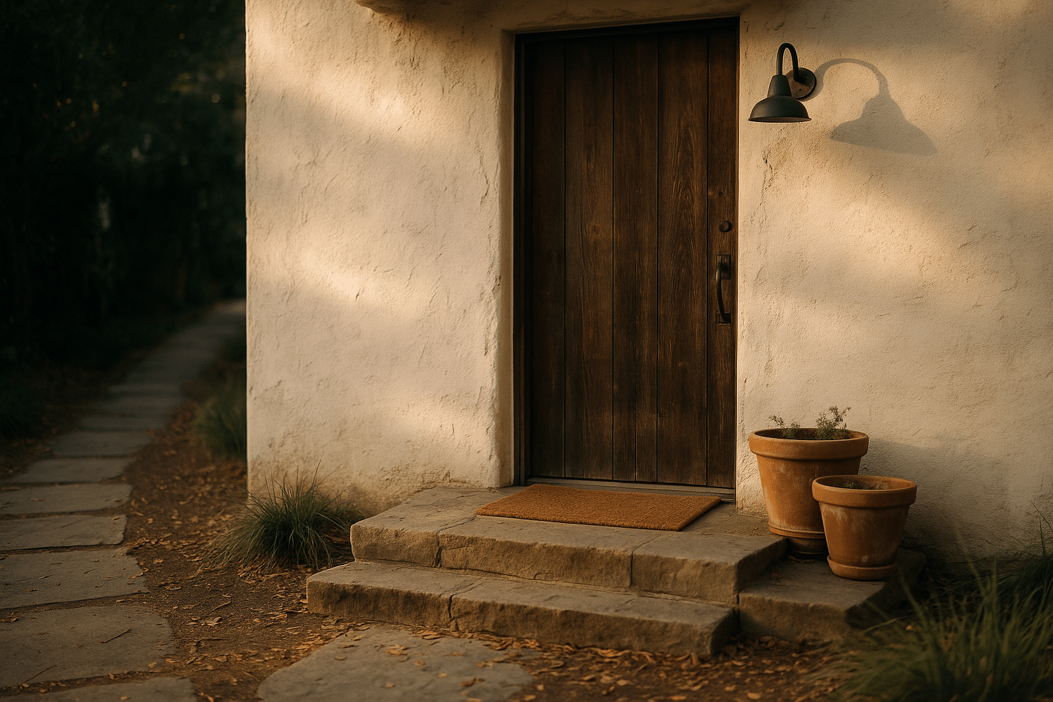
The door is the handshake of your home. Beyond style, it sets expectations for sturdiness, energy efficiency, and maintenance. Common constructions include solid wood, insulated steel, and fiberglass. Solid wood offers tactile warmth and can be refinished repeatedly, but it needs protection from harsh sun and heavy moisture. Insulated steel provides crisp lines and strong security, often with insulation values in the R‑5 to R‑6 range; surface dents are possible but repaints are straightforward. Fiberglass resists warping and swelling, accepts stain or paint convincingly, and rivals steel in insulation; it is a practical pick for variable climates.
Color is your quickest transformation tool. Warm hues (reds, corals, golden ochres) tend to “advance,” making the entry feel closer and more welcoming from a distance. Cool tones (deep blues, charcoal, forest green) recede, lending calm and composure. Neutrals with depth—think earthy taupe or soft graphite—pair nicely with natural materials and let hardware shine. Test swatches outdoors, because daylight shifts color dramatically; morning light cools tones, while late afternoon warms them. When in doubt, echo a nearby element, such as a roof shade or masonry tone, to anchor the palette.
Hardware and glazing sharpen both function and character. Lever handles are easier for hands of all ages and for guests juggling bags. A view panel or sidelight can borrow light from outside; use frosted or textured glass for privacy. Weatherstripping and a tight door sweep block drafts and dust; a snug fit often changes how a space feels by reducing street noise. If accessibility is a consideration, a low threshold (ideally no more than about 1/2 inch, beveled) minimizes trips and keeps rolling access smooth.
Layer details to finish the composition: a coir mat scrapes debris effectively, a second woven rug inside absorbs moisture, and a boot tray corrals mess. If you want a refined accent without shouting, choose one standout element—a patinated bronze handle, a textured paint finish, or a vertical slatted screen beside the door. The goal is a durable statement that still feels relaxed, honest, and easy to live with.
Lighting, Readable Numbers, and Calm Wayfinding
Light shapes emotion and safety long before anyone reaches the latch. Start with three layers. Ambient light (soft, even glow at the porch) sets the mood; accent light (a beam on a plant or textured wall) adds dimension; task light (focused at the lockset) makes keys and packages easy. Warm color temperatures around 2700–3000K feel inviting and help skin tones look natural, while cooler tones can appear stark outdoors at night. Position fixtures to reduce glare: aim light onto surfaces rather than into eyes, and shield bulbs from direct view.
Practical guidelines make setup simpler. Mount wall fixtures near 66–72 inches from the porch floor for balanced spread. For paths, low bollards or down‑facing markers spaced roughly 6–8 times their height apart help avoid “runway” hot spots. Steps benefit from subtle riser lighting or a small wash from beside the railing. Motion sensors curb energy use and discourage loitering without creating startle flashes when paired with gentle ramp‑up settings. A dusk‑to‑dawn control or a simple timer maintains consistency, reassuring to residents and guests alike.
Readable address numbers support deliveries and emergency response. Many municipalities expect numerals at least 4 inches high, in a contrasting color, placed in a location visible from the street or corridor lighting. Choose fonts with clear strokes and generous spacing; thin, decorative scripts can be hard to decode at night. If you light the plaque, use a shielded, downward wash to avoid glare. Inside multi‑unit buildings where exterior signs are controlled by management, draw attention to your door with a distinctive but quiet doormat pattern and a warm halo of light that does not spill under neighbors’ thresholds.
Wayfinding also includes small tactile cues. Underfoot textures mark transitions—the crunch of fine gravel near a garden step, the firm edge of a stone landing, or the soft give of a mat. Consider reflective aggregates in concrete or the subtle sheen of wet‑look stone sealers for low‑glare sparkle. The aim is a calm path that feels obvious, not overlit, with light guiding the eye and feet in the same direction.
Landscaping and Threshold Transitions: Greenery, Paths, and Weather
Plants and paving provide your entry’s rhythm. Start with scale: containers that are about one‑third the height of your door make a pleasing frame without crowding the latch. In narrow settings, single tall planters with slim profiles on the hinge side leave room to swing in. Mix evergreen structure (dwarf conifers, clipped box, or sturdy grasses) with seasonal color for year‑round presence. Choose varieties that won’t snag clothing or drop messy berries right at the threshold; tidy leaves and non‑thorny textures earn their keep.
Path materials set tone and maintenance. Cast concrete is durable and budget‑friendly; add a broom finish or exposed aggregate for traction. Clay brick gives historic character and warmth; sand‑set systems allow minor movement without cracks. Large format pavers create a modern, calm grid; align joints with the door centerline for a composed look. Fine gravel offers a soft crunch and excellent drainage but may migrate—use a sturdy edging and stabilize the base to keep stones in place. Where rainfall is heavy, permeable pavers reduce puddles and feed nearby plantings.
Drainage and slope protect the entry and your shoes. Aim for a gentle 1–2 percent slope away from the house so water does not collect at the sill. Add a boot scraper or grated channel in snow‑prone regions to shed slush before it crosses the threshold. A canopy or deep eave (around 30–36 inches if possible) keeps the landing dry and extends the life of the door finish. In windy zones, a side screen or trellis with open slats calms gusts without creating a solid wall; this also offers a vertical anchor for vines or seasonal decor.
Think of transitions as layered checkpoints. Outside: a coarse mat and a place to set bags. Threshold: a durable saddle or metal angle protecting flooring edges. Inside: an absorbent rug and a landing surface tough enough for wet soles. Small choices—like setting the first indoor hook within one step of the door—prevent clutter from spreading. The cumulative effect is graceful: a path that looks good on sunny days and works hard when the weather turns.
Storage, Seating, and Seasonal Personality
An entrance lives or dies by how well it handles real life. If you do nothing else, combine a seat, a surface, and a catch‑all. A bench 15–18 inches deep lets you tie shoes without wobbling; add a shelf or baskets below for pairs in rotation. A narrow console or wall‑mounted ledge catches keys and mail. Hooks at about 66–70 inches keep coats accessible but off your shoulders, and lower hooks help kids learn to park their gear independently. In tiny spaces, a flip‑down seat, a slim cabinet, or a pegboard panel turns a bare wall into a hardworking station.
Organize by zones to tame mess. Create a “wet zone” at the door for umbrellas and boots, a “grab‑and‑go” zone for wallets and masks, and a “nice to have” zone for extras like sunglasses or dog leashes. Labeling can stay discreet: varied textures or container shapes signal purpose without visible text. Mirrors brighten entries and offer a last‑look check; choose one roughly two‑thirds the width of the console for balance, or go tall and narrow to amplify height in a petite foyer.
Seasonal style adds personality without crowding the space. Instead of bulky decor, rotate small elements with big impact: a different planter mix each season, a subtle wreath made of herbs or grasses, or a textile swap for the inside rug. Keep a “seasonal kit” in a single bin—hooks, ribbons, shelf accents—so refreshes take minutes, not an afternoon. Scent is part of the welcome: potted rosemary or citrus near sunlight brings a clean note that beats synthetic fragrances.
Maintenance sustains the magic. Build micro‑routines into your week. For example:
– Wipe handles and the peephole during a quick trash run.
– Shake the mat when you collect the mail.
– Check for burned‑out bulbs every Sunday evening.
– Do a monthly hinge lube and weatherstrip check before seasons change.
These low‑effort habits keep the entry feeling cared for, which guests notice immediately and you appreciate with every return home.
Conclusion: A Welcome That Works Every Day
A creative entrance does not require grand gestures—it thrives on clear flow, durable materials, thoughtful light, and storage that respects daily routines. Start with one upgrade that solves a real problem, then layer character as you live with the space. Over time, the first five seconds of arrival become a quiet highlight of your day, and your door tells a consistent story: you’re home, and you’re ready to welcome others in.


